There are a lot of people talking about the FM27 UI right now. I've watched the first looks, stared at the screenshots, and generally done what I always do when Football Manager changes something: immediately try to work out what's different.
But the thing I'm most interested in isn't whether FM27 looks better than FM26. What actually interests me is whether FM27 fixes the problem I had with FM26. And that problem wasn't really that I couldn't find things, it was that getting to the thing I wanted to do could sometimes involve an unnecessarily long journey through screens.
SI has now explicitly talked about reducing clicks and unnecessary navigation, putting more information on the screen you're already using, improving customisation and making better use of available screen space. You can read the full breakdown in SI's FM27: Clearer Interface, Smoother Navigation feature.
So rather than just looking at whether the new interface is prettier, I wanted to look at whether it might actually make Football Manager less of a faff to use.
The clicks were the problem
My issue with FM26 wasn't that I was sitting there completely baffled about where something was. Most of the time, I knew what I wanted to do, and I could probably work out where I needed to go. The frustrating bit was how many steps it could take to actually get there.
One extra click isn't a big deal. Neither is one extra menu or another screen. The problem is that Football Manager isn't a game where you do something once and move on. You do the same things over and over again for hundreds of hours, so a couple of unnecessary steps repeated constantly eventually become a surprisingly large amount of unnecessary faffing.
And that's why, for me, the most interesting part of FM27 isn't simply that the interface has been redesigned. It's that SI appears to have looked at how all those individual screens and menus fit together.
FM27 starts with navigation
This is probably the biggest reason I'm interested in the new UI. SI has changed the primary and secondary navigation, with the main areas now centred around Portal, Squad, Tactics, Recruitment, Training and Club. There are also improved secondary menus and dropdowns for getting into the more specific parts of each area.
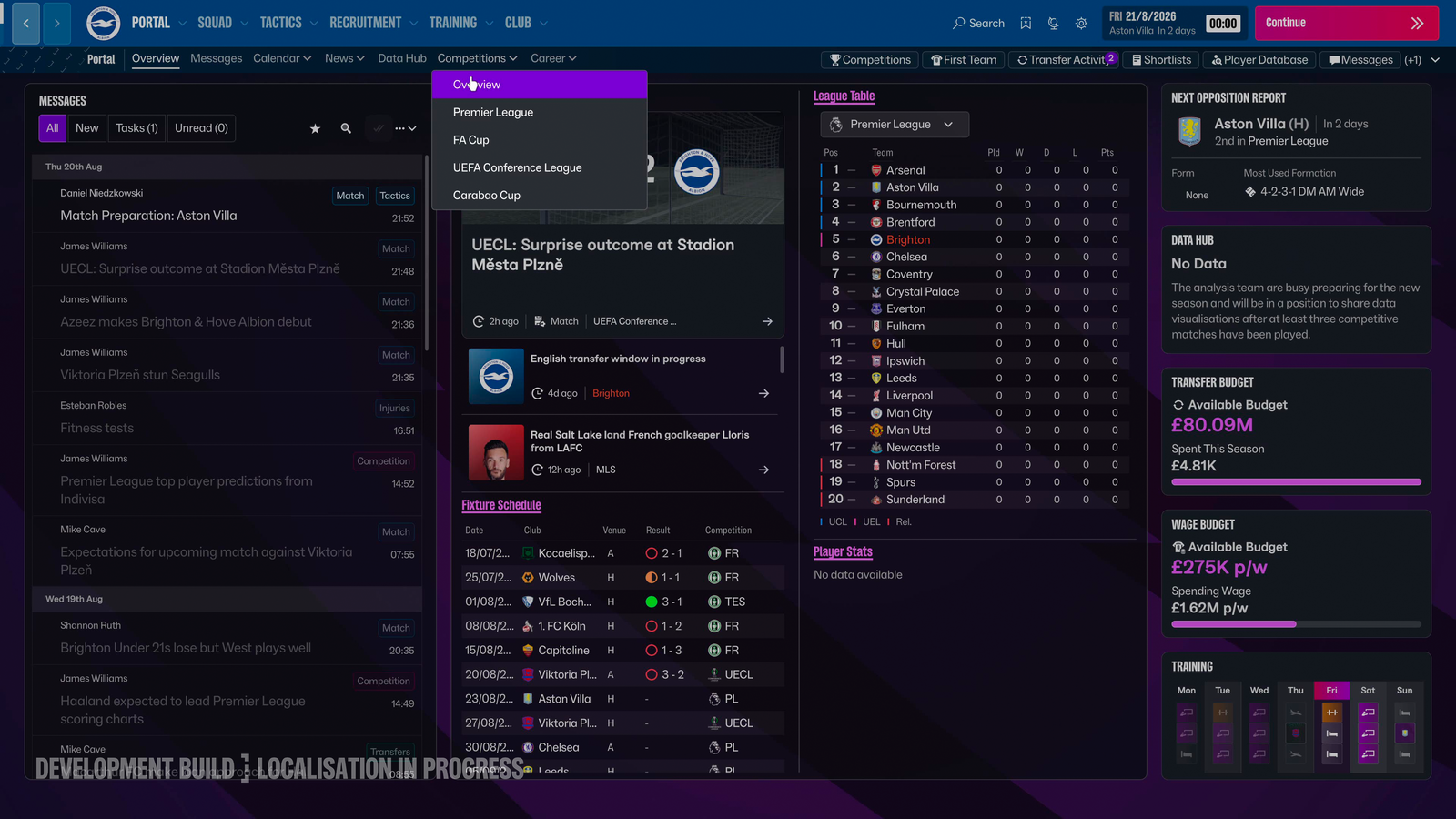
And there's a very simple idea behind that which I really like: navigation should navigate.
If I'm trying to get somewhere, I want the navigation to get me there. Once I'm there, I want the screen to give me the information and tools I need. That's the distinction FM27 seems to be making much more clearly.
Portal: less navigating, more information
The Portal is probably the easiest place to see the difference in approach. FM26 used cards and tiles for both information and navigation, so the things sitting on the screen could also become part of the route through the game.
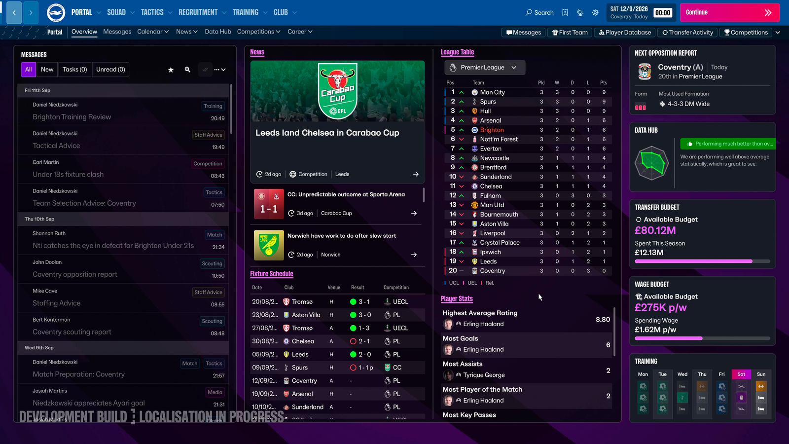
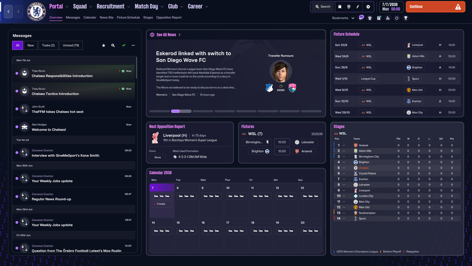
FM27 moves more of that navigation responsibility into the primary and secondary menus. That might not sound particularly exciting, but it gets to the heart of what I'm looking for here: if I'm looking at the Portal, I want it to tell me useful things about what's going on, not make me work out which bit of it I need to click to get somewhere else.
And that could be a much bigger quality-of-life improvement than it sounds. If the places I use regularly are consistently available through the navigation, I don't have to rely quite so much on my increasingly poor memory of "I'm sure this was under that menu..." every time I want to do something.
Squad: just give me the information
The Squad screen shows another part of the same thinking. FM27 introduces a control panel on the main screens, and brings important actions like tactics and training into the screen rather than making me leave to go and find it somewhere else.
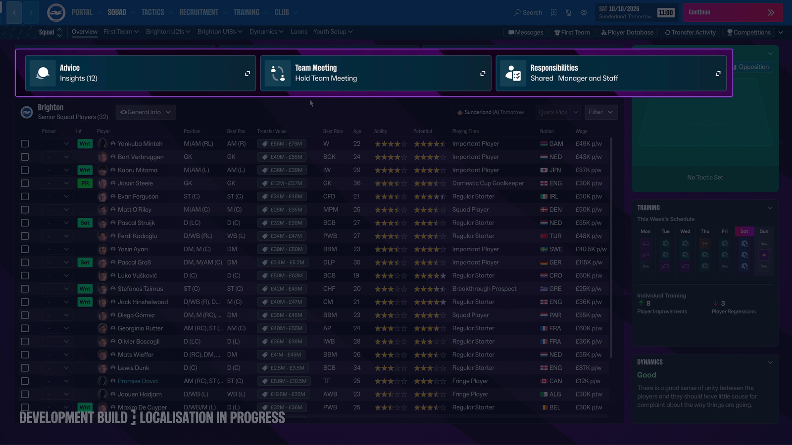
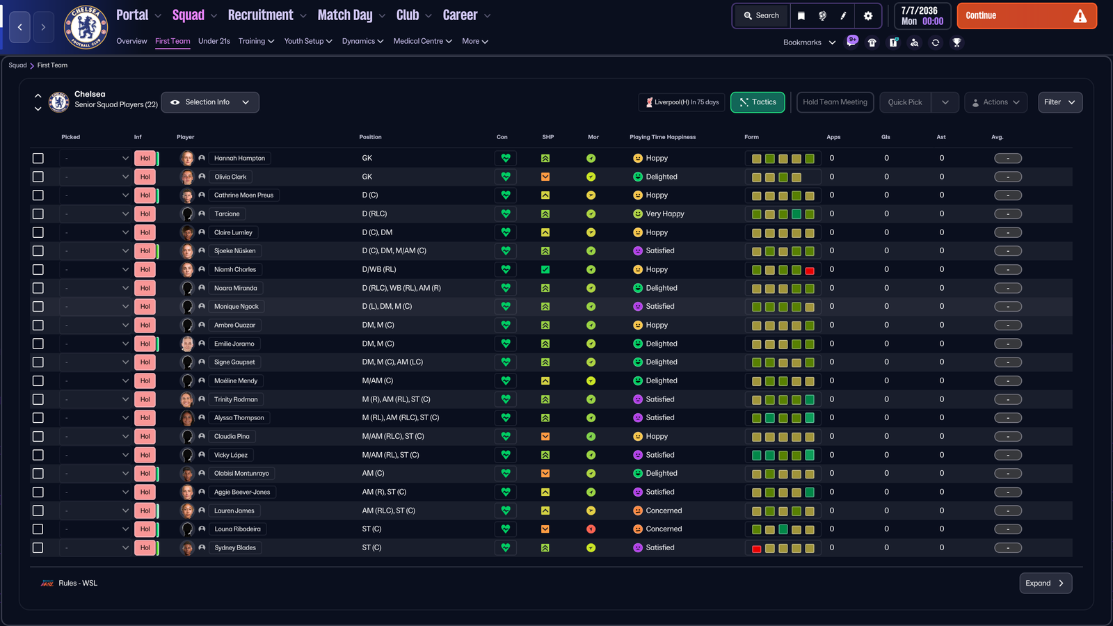
This is exactly the sort of change I'm interested in because it puts the relevant actions where I'm already working. If I'm looking at my squad and I want to do something with my squad, I'd quite like the tools for doing it to be somewhere nearby.
That's really what the control panel is doing: keeping useful actions together and accessible while I'm already on the screen where I need them. It means the tools are there when I need them, rather than making me go looking for them
I'm not asking Football Manager to do everything for me. I just don't think "where the hell did that button go?" needs to be part of the gameplay.
Bookmarks: because apparently I need labels
Bookmarks are another example of FM27 trying to make navigation a little more obvious. They now have text descriptors, can be rearranged, and shortcuts can be customised.
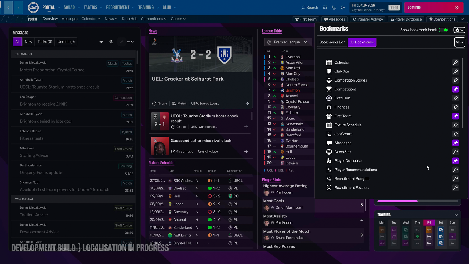
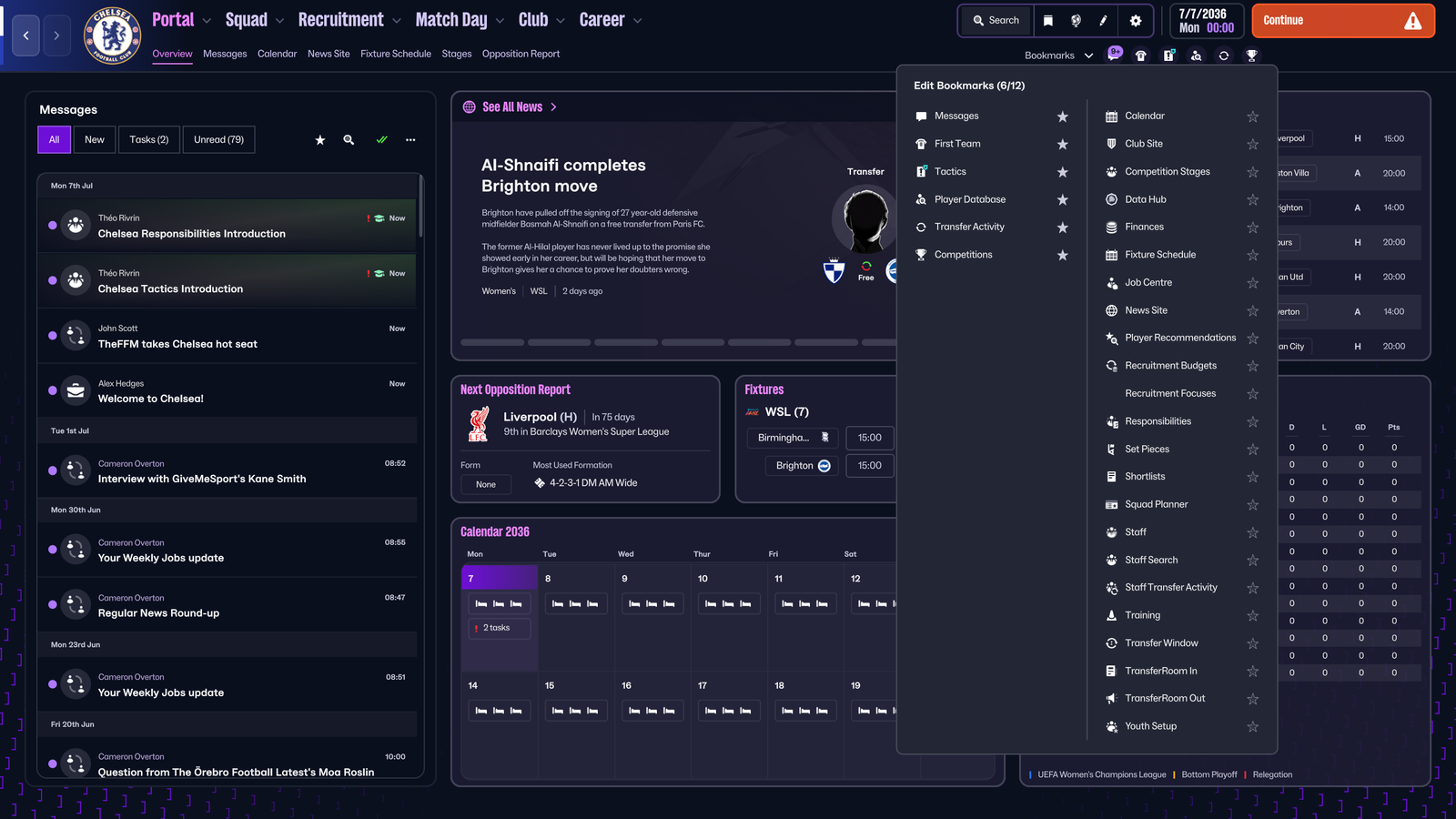
There was a certain amount of "I think I recognise that icon..." involved with FM26. Once you've played enough, you develop your own mental map of the interface, but I'm not entirely convinced Football Manager should require me to memorise a collection of tiny symbols just to get around.
Giving those destinations clearer labels makes the system much easier to understand at a glance, while being able to rearrange things means I can put the places I actually use where I want them. Which seems fair. I've already spent over twenty years adapting myself to Football Manager's quirks, perhaps it will meet me halfway this time.
Customisation: let me decide what I actually need
SI has also introduced more ways to customise areas, including swapping tiles, changing landing screens and adjusting shortcuts.
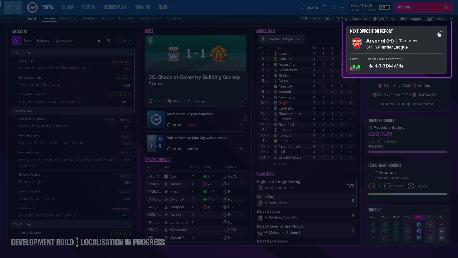
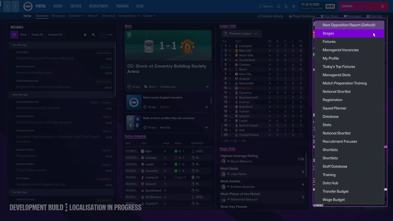
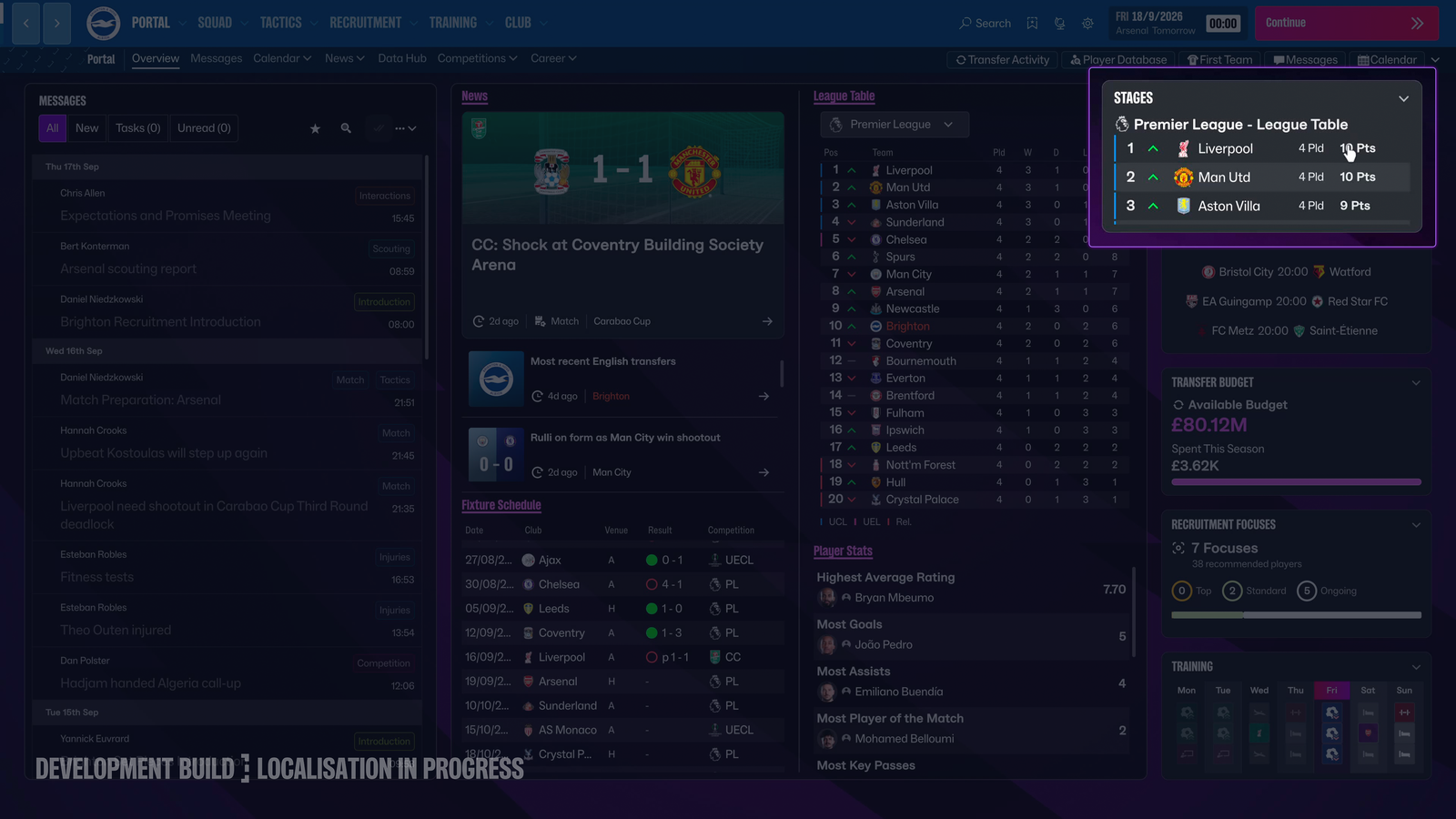
That matters because there isn't really one correct way to play Football Manager. Some people are going to want recruitment information everywhere. Some people will spend their lives in squad management. Some people will spend an alarming amount of time staring at training screens.
The useful part is that the UI doesn't assume everyone needs exactly the same things in exactly the same places. If I can configure the screens I use most often around how I actually play, I can spend less time navigating towards the things I care about and more time actually using them.
Messages: tell me the thing
Messages are getting a similar rethink, moving back towards something closer to how they used to work before FM26. They're colour coded to help distinguish different types of information, but the bigger change is that more of the useful information is actually there in the message itself. If there's something I need to do, I can also deal with it straight away.
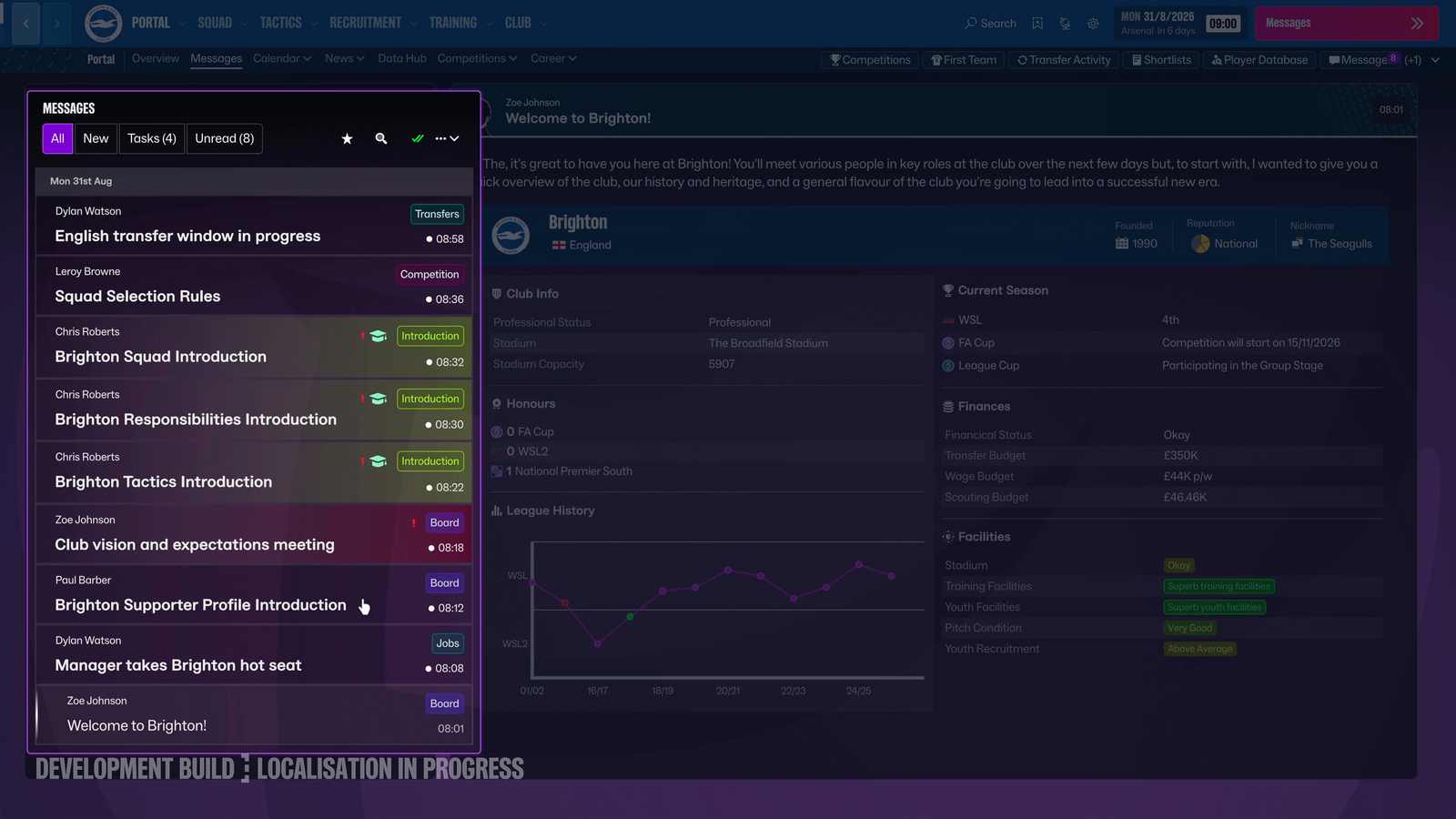
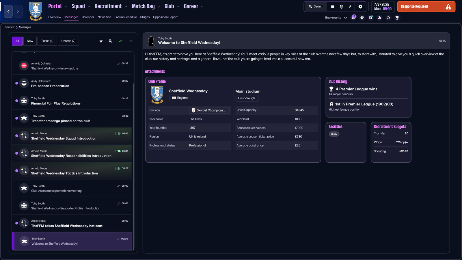
This is another place where unnecessary navigation in FM26 would creep in. You get told something has happened, click into it, click again to find out what it actually means, then potentially go somewhere else to do something about it.
The FM27 approach is much more straightforward: tell me the thing, give me the useful information, and let me deal with it. If I can understand what's happened and take the appropriate action without opening another three screens, that's exactly the sort of friction I'm talking about.
Cards aren't the enemy
I don't want this post to turn into "cards bad, full-screen good", because that isn't really the point. Cards are useful. Football Manager contains an absolutely ridiculous amount of information, and having that information broken into manageable chunks can make it much easier to scan.
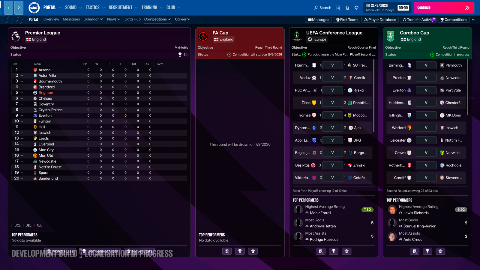
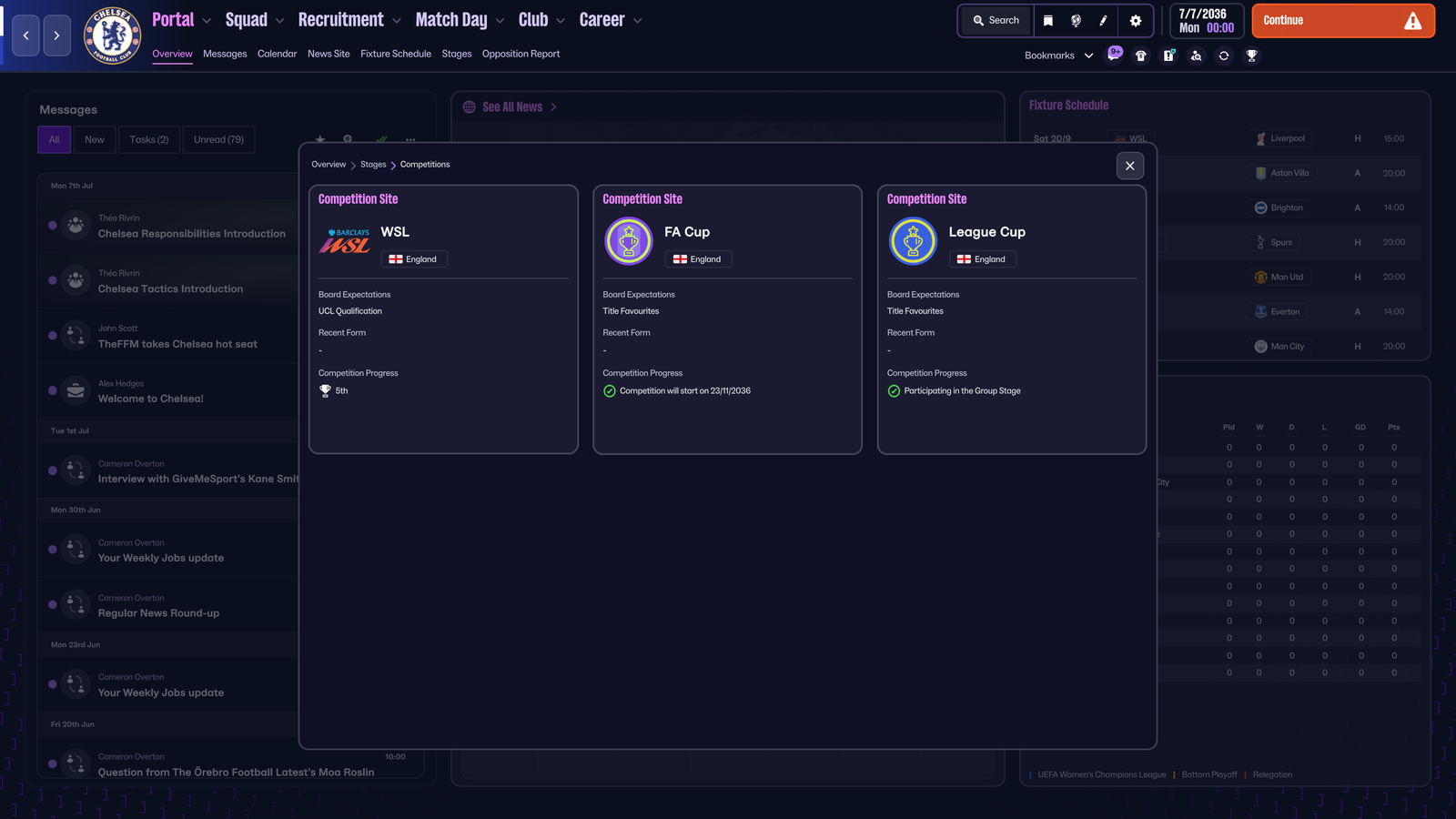
The more interesting change is knowing when a card is actually the right tool. SI says fewer cards are being used in FM27, with more information moving towards full-screen experiences instead.
I'm perfectly happy to have lots of information. This is Football Manager. I expect to have to have lots of information. But what I don't particularly need is to open three increasingly specific boxes to get to that information.
So the change isn't really about removing cards for the sake of removing cards - it's about giving different types of information the space and presentation they actually need.
And then there's the actual screen I'm looking at
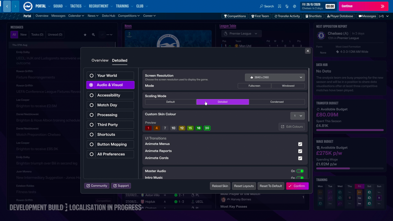
FM27 is also trying to make better use of the screen itself. SI has talked about support for different resolutions, scaling options, ultrawide displays and 4K, with tables able to use more of the available space.
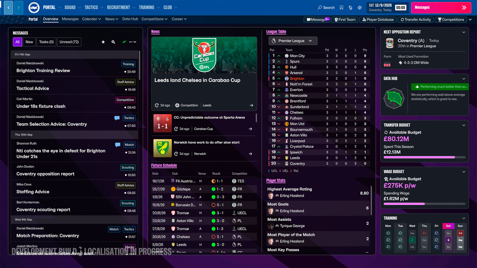
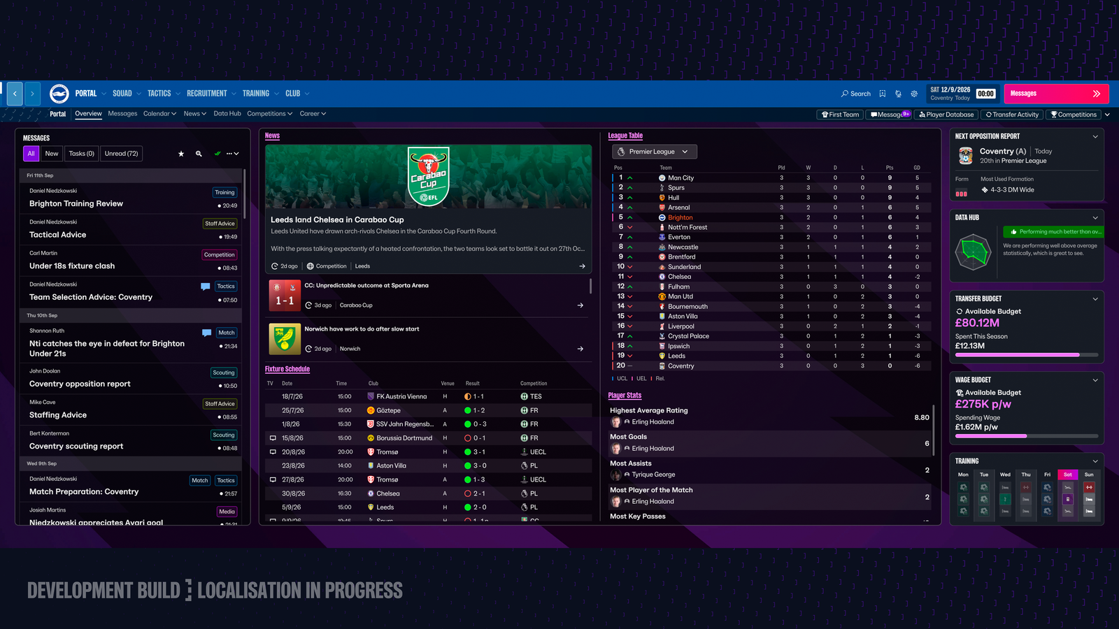
This sounds incredibly basic until you've spent years playing a game where buying a bigger monitor doesn't necessarily mean the game gives you proportionally more useful information.
Screen size isn't the same thing as usable space, either. A huge monitor can still be awkward if everything is tiny, while a laptop needs a completely different approach. The scaling options are basically SI acknowledging that not everyone is playing on the same screen.
Better late than never
I'm actually quite encouraged by the direction. Not because FM26 was some unusable disaster - it wasn't - but because FM27 seems to be addressing something that could affect how the game feels over hundreds of hours rather than simply giving us another visual refresh.
SI has said the UI and UX work has been informed by community feedback and internal reviews, with the focus on making navigation more intuitive, putting more information where it's useful and giving players greater control over the interface. Whether every individual change works exactly as intended is something we'll only know once we're actually using the game, but the reasoning behind the redesign makes sense to me.
The screenshots can show us what has changed. They can show us the new navigation, the control panels, the customisation and the different approach to cards.
What they can't show us is whether any of this actually makes Football Manager quicker to use. I can look at it and think, "That looks like it should be quicker." But I can't tell from a screenshot whether something that took six clicks in FM26 now takes three.
And that's the bit I'm interested in. Not whether FM27 looks nicer, but whether I can sit down, decide what I want to do and get there without all the extra faffing in between.
We'll only know that once I'm actually playing it.
For now, I'm taking the screenshots for what they are: a look at the direction FM27 is heading. The proper test comes when I'm actually using the game and doing all the repetitive little things that make up a Football Manager save.
So there's really only one sensible thing left to do.
I'm going to count the clicks.
Not whether something feels quicker. Not whether someone on Twitter tells me they've saved approximately four seconds per season.
Actual clicks.
Because if FM27 really is about getting me from "I want to do this" to "I've done it" more efficiently, I should be able to prove it.
And if I can't, well... I've already spent thousands of hours clicking around Football Manager. What's a few hundred more?